COCLIA
Branding
Coclia started as a branding assignment for a university class: create a full identity for a Ready-to-Drink cocktail brand from scratch. I didn't want to start with a mood board, I started with the name, spending most of the first week just reading through Latin roots until I landed on "coclia," spiral, snail. It stuck because it worked on two levels at once: it sounded like a real product name, and it gave me an actual shape to design around instead of an abstract concept to chase.


Once I had the spiral, the logo came together fast. It's literally the name drawn out as a spiral, but tilt your head and it also reads as a cocktail glass seen from above, the swirl a spoon leaves behind after a stir. That double meaning became the rule I held every other decision against: if it didn't connect back to that one shape, it didn't make it into the system. It's a small constraint, but it kept the whole identity from turning into a pile of unrelated pretty choices.

The color palette took longer to get right than the logo did. My first instinct was to pick "cocktail colors", pinks, oranges, the obvious stuff, but it read more like a drinks menu than a brand. I rebuilt it around function instead: one saturated color per flavor, so the product line could grow without the system falling apart, a softer secondary palette of warm neutrals for packaging and backgrounds so the product colors could actually stand out instead of competing with everything around them, and two accent colors reserved only for small highlights and detail work.
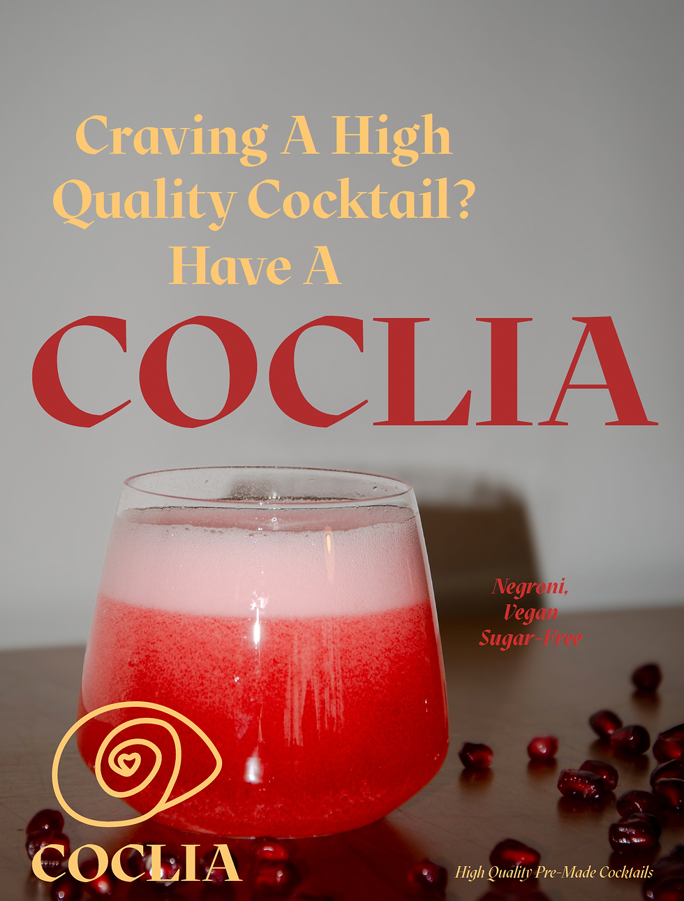


Once that structure held up, everything else came together in a way that just made sense: six campaign posters exploring different moods off the same palette, each one built around photography I shot myself rather than stock images, plus a short animated version of the poster for social. It's still one of the projects I go back to when I need reminding that a good brand isn't a collection of nice decisions, it's one idea, followed all the way through.

Once that structure held up, everything else came together in a way that just made sense: six campaign posters exploring different moods off the same palette, each one built around photography I shot myself rather than stock images, plus a short animated version of the poster for social. It's still one of the projects I go back to when I need reminding that a good brand isn't a collection of nice decisions, it's one idea, followed all the way through.


Alongside the campaign, I made a small series of frame-by-frame GIFs for Coclia that never ended up in the final system. They didn't fit where I needed them to, but I liked them too much to just delete, so here they are anyway.