HONOUR AMONG THIEVES
A Board Game
Honor Among Thieves is a cooperative heist-themed board game built around a simple feeling: the tension of pulling off a job as a team, where every choice costs something. I wanted a game that wasn't about optimizing moves, but about that specific kind of pressure, so I designed the full system around it: the cards, the board, and a visual identity that had to carry the tension the mechanics were built to create. I designed the gameplay together with a friend, trading the rules back and forth until they actually felt like a heist instead of a theme slapped onto a generic card game.


The core of the game is two intertwined systems, Heat and Risk, and getting them to actually work against each other took a lot of back and forth. Push too hard for a clean success and the Heat climbs; play it too safe too often and you run out of turns before the job is done. Neither system could just sit in the background as a number, players needed to feel the trade-off every time they made a choice, so a lot of my early card design was really just trying different ways to make a single decision feel like it mattered.
Card Designs
For the cards themselves, I kept things deliberately simple, partly a time constraint, partly a real design choice my friend and I agreed on early. We wanted something clean and modern rather than illustration-heavy, a look that felt like it belonged to a sharp, put-together heist crew rather than a fantasy card game. Less detail per card meant players could read information faster too, which mattered more than making each card a tiny piece of art.


Character Cards
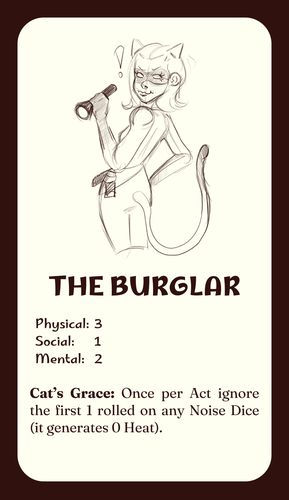


Game Cards
There are way more cards than I could ever fit here, so consider this a small taste rather than the full deck.


Once the mechanics held together, I built the full card sets, Character, Item, and Intel cards, each with their own visual hierarchy so players could read a card's function at a glance mid-game, without breaking the pace. The board and the Risk meter came next, designed to sit at the center of the table as the thing everyone's eyes kept going back to, since that's where the tension is supposed to live. I pulled the whole palette and type system from old heist-movie posters: high contrast, a little worn at the edges, nothing too clean or corporate.
It ended up being as much a game design exercise as a graphic design one. Figuring out how the visuals could reinforce a rule, or make a risky choice feel riskier just by how a card was laid out, taught me more about the relationship between mechanics and visual design than any purely illustrative project has. It's still the project I point to when someone asks what I mean by design that does more than decorate.
Game Tracker and Risk Meters

Rule Sheet
